 "Funktheduck" (funktheduck)
12/04/2018 at 09:58 • Filed to: None
 2
2
 9
9
 "Funktheduck" (funktheduck)
12/04/2018 at 09:58 • Filed to: None |  2 2
|  9 9 |
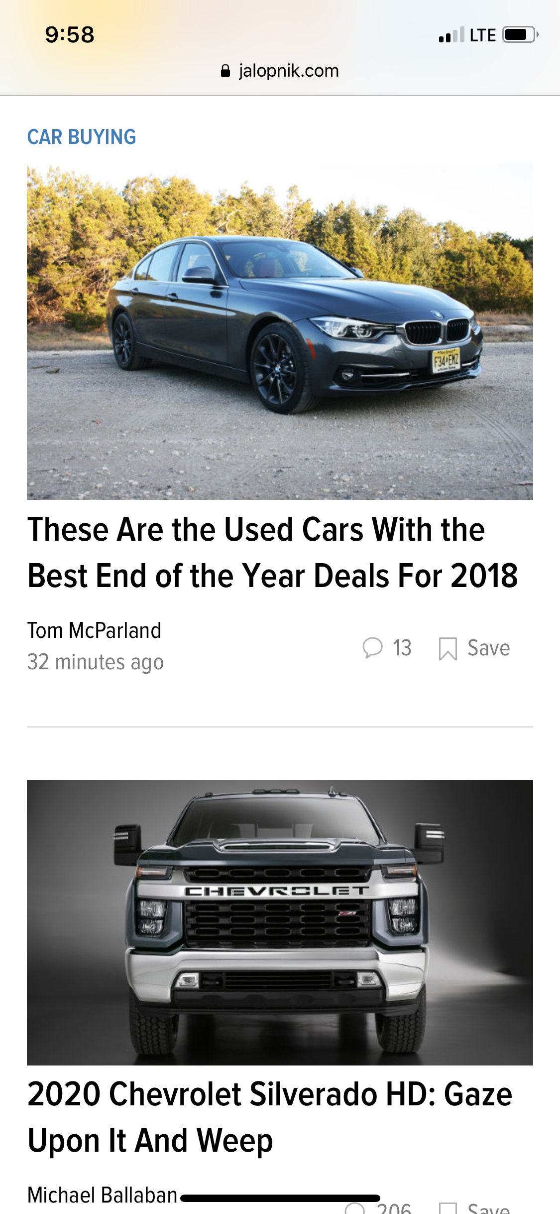
Looks awful. Looks like one of those pop up ad/clickbait sites that get shared all over Facebook.

 user314
> Funktheduck
12/04/2018 at 10:09 |
|
Pretty sure that exactly the look they’re going for.
 davesaddiction @ opposite-lock.com
> Funktheduck
12/04/2018 at 10:21 |
|
Dislike.
 The Crazy Kanuck; RIP Oppositelock
> Funktheduck
12/04/2018 at 10:22 |
|
Did you expect anything less from Kinja?
 Funktheduck
> The Crazy Kanuck; RIP Oppositelock
12/04/2018 at 10:56 |
|
I have some standards. Kinja appears to not
 Funktheduck
> davesaddiction @ opposite-lock.com
12/04/2018 at 10:56 |
|
Very much. It’s distracting it’s so bad.
 davesaddiction @ opposite-lock.com
> Funktheduck
12/04/2018 at 10:58 |
|
OPPO #Solutions?
https://oppositelock.kinja.com/lorem-ipsum-___-dolor-sit-amet-consectetur-adipiscing-1830849184
 Future Heap Owner
> Funktheduck
12/04/2018 at 11:43 |
|
I dunno, I’ll probably get used to the layout overall. The thing I think is truly a problem is that you see or don’t see an excerpt from each post depending on whether you’re on a phone-sized browser or a desktop-sized one. Content should be consistent.
 Funktheduck
> davesaddiction @ opposite-lock.com
12/04/2018 at 12:24 |
|
Seems legit
 Funktheduck
> Future Heap Owner
12/04/2018 at 12:26 |
|
The main page posts look just like the ads. It looks awful.